Pages in this section
Introduction
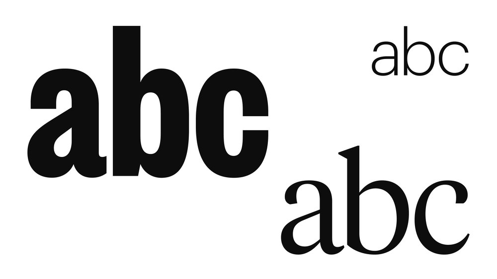
Our brand uses three different typefaces which captures new and old coming together. We communicate in a number of ways and our typefaces need to reflect this.
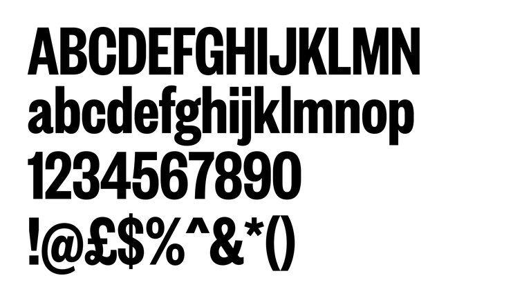
Founders Grotesk
Founders is a modern cut of a classic typeface. It offers a bold and confident voice and is used across our headlines.
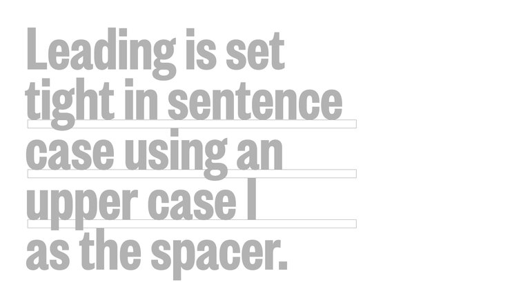
Leading
Headlines are in Founders Grotesk X-Cond Semi-Bold with tight leading.
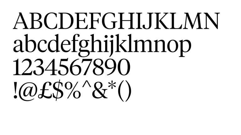
Tiempos
Tiempos is used for quieter moments and refined typesetting. It has a classic aesthetic which captures the heritage of our brand and echoes the serif in the monogram.
Subtitles are typeset in Tiempos Headline Light providing a refined and clear contrast to opening titles.
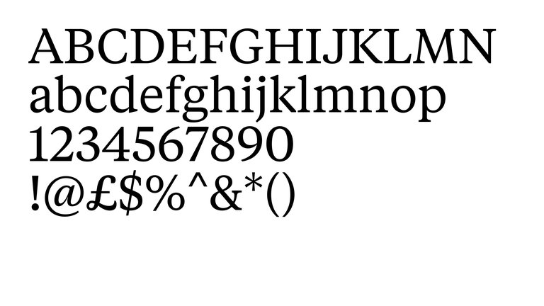
Tiempos body copy
Body copy is set in Tiempos Regular, with a wider stroke which helps legibility when setting large areas of type. It's perfect for large areas of text both on screen and printed within books, reports, leaflets and digital assets.
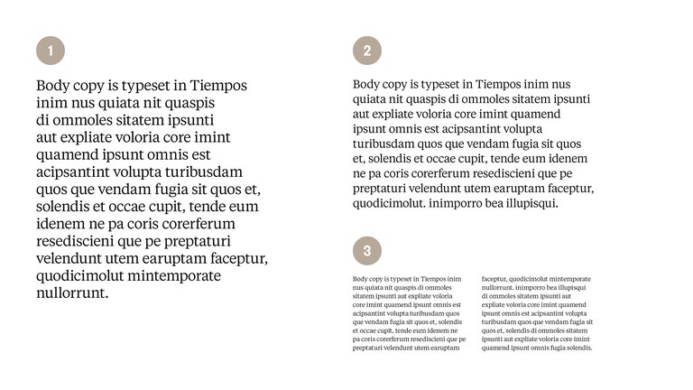
Good practice and accessibility
Make sure to follow the guides below when setting text at different scales. Leading is set at an appropriate distance to ensure clear legibility, tracking is set at -5 which helps tighten up text.
- 30pt Size / 36pt Leading / -5 Tracking
- 20pt Size / 26pt Leading / -5 Tracking
- 11pt Size / 15pt Leading / -5 Tracking
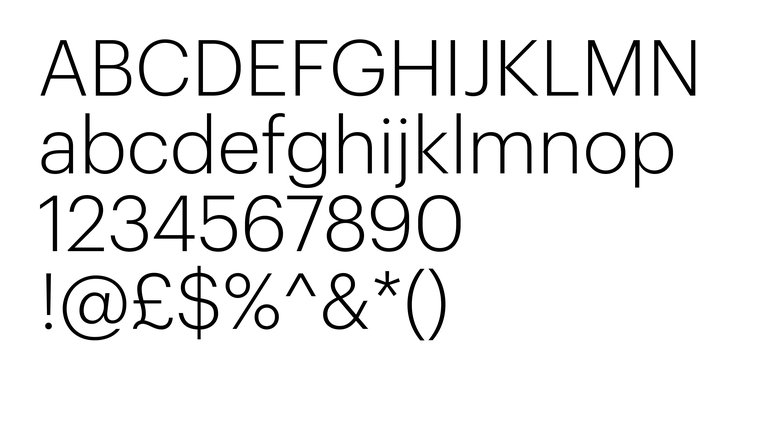
Graphik
Graphik provides a neutral ground to make smaller details accessible and provides a light touch against Founders and Tiempos.
URLs, sign-off information, page numbers, footnotes and credits are all typeset in Graphik Light. This provides a clear difference between body copy and supporting information to help legibility and speed when accessing important text.
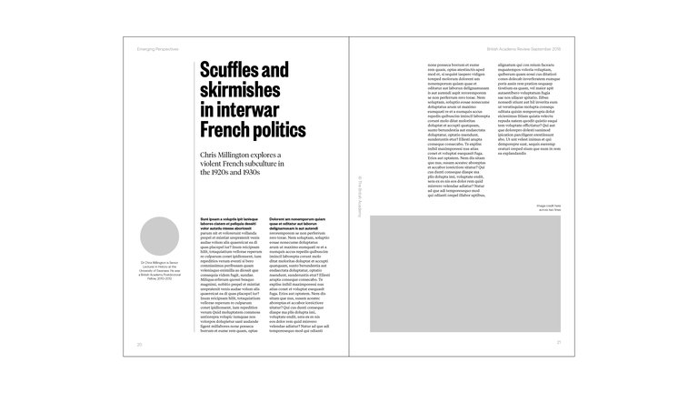
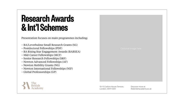
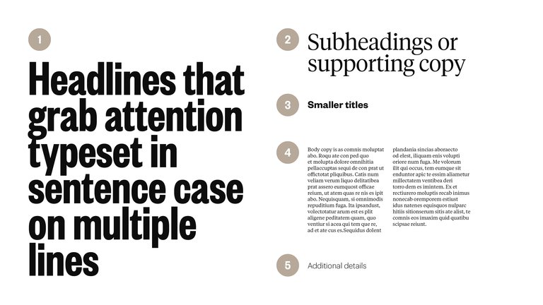
Overview
This overview demonstrates how the typefaces work together and shows how they should work at different scales.
- Founders Grotesk X Condensed
- Tiempos Headline Light
- Founders Grotesk Semi-bold
- Tiempos Text Regular
- Graphik Light
In use
Examples demonstrate how the typefaces work together and how they should work at different scales.